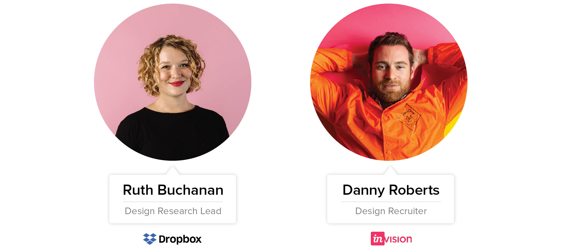
Whether you are just starting out or already a design-virtuoso - your portfolio plays a huge role in what projects and new job roles will be available to you. We spoke to Ruth Buchanan, a Design Research Lead at Dropbox, Danny Roberts, a Design Recruiter at InVision and Keagan Hoffman, User Interface Designer at Glucode an app development company. We bombarded them with questions and they graciously shared their personal insights.
Since the beginning of the year, we have reviewed the profiles of over 500 UI/UX designers in South Africa. The most popular design candidates on OfferZen often have over 14 interview requests from companies. The first thing those companies want to see? A portfolio. A strong portfolio of work has been the biggest indicator of how well someone will do on OfferZen. Since a lot of designers have asked us about the best tips and tricks to build a great portfolio, we decided to reach out to some of the leaders in the field and compile this guide.
Why does a UI/UX portfolio matter?
We know that putting together a great portfolio is hard work. Here's why it's not just worth it but absolutely essential that you make the effort: Companies value portfolios even more than a CV, because it helps them to actually see a designer's abilities and potential. Danny says:
“First, it’s quite shocking how often designers don’t have a portfolio or don’t keep one up to date. You never know when the next amazing opportunity will arise and they’re really actually important in most job interviews.”
Your portfolio is your chance to showcase your unique personality, what you excel at and how you’ve developed your skill set. Companies want an instant visual representation of the kind of work they can expect from you as well as an indication of where you can go in the organisation.
That's why you shouldn't only use your portfolio as a showcase of your UX understanding. Instead, where applicable, make sure to also demonstrate your project management and problem-solving skills within a team framework and your ability to craft engaging UI. Here’s how:
What to consider when creating your portfolio?
Remember you are not the user of your portfolio, the company is. Amongst a mountain of other portfolios a company is looking at everyday, yours has about 30 seconds to grab their attention. That’s why it should show at first glance what makes you different to other designers!
Glucode's Keagan Hoffman has great advice to help you think about this: “Adapt your portfolio to the environment. Make sure to consider what role you’re applying for when putting your portfolio together. If it’s a UI design role, then your portfolio should demonstrate your UI design abilities, and not your development abilities, and visa-versa. Think of it as UXing your portfolio for your employer.”
What should you include in your portfolio?
Your projects are the heart of your portfolio. Shoot for the top 3 unless you need to emphasize skills that don’t shine through in your best work. “Honestly, as someone who’s evaluating other designers, I’m only going to look at probably three that show a little bit of breadth,” Ruth says. She advises to choose:
- One that's comprehensive overall - showing the entire process in detail
- One that's more constrained - with regards to time or resources and
- One that’s more exploratory - generally something like a personal project.
That said, each of these three project-showcases should include:
- An overview of the client, the problem, objective, the team and the timeline,
- The processes you used to solve the problem and
- The final outcome.
Include a short section about yourself that highlights your strengths, soft skills and personality traits. Finally, include your contact details and links to the platforms you are most active on - you don’t want to win over a hiring manager only to lose the assignment due to missed messages!
Note: Even if you are a senior designer, update your portfolio periodically. A great piece from 10 years ago doesn’t demonstrate that you are on top of current trends!
Give a brief overview of the project
Context is key when it comes to your portfolio. The overview is like an introduction to your projects, it lays the foundation for the the viewer to understand what the problem was. Without the foundation, everything is left in the air. The viewer won’t be able to understand your the solution if they don’t know what the problem was. Keep it simple and cover the basics:
- Who was the client?
- What was the problem?
- What was the objective?
- Who was in your team?
- What was the timeline for the project?
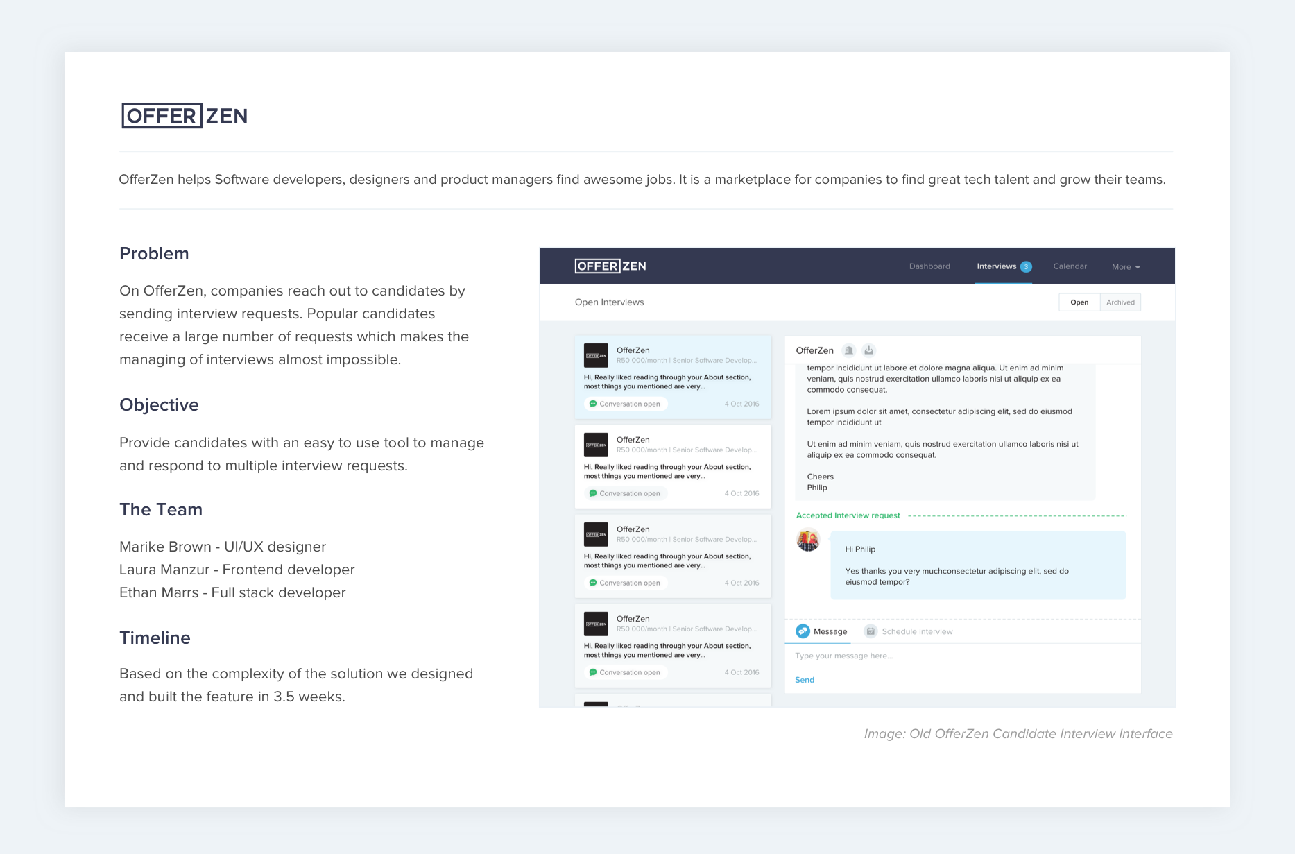
As an example, here is a UI and UX project that I worked on with Laura Manzur and Ethan Marrs. It’s a redesign of OfferZen’s candidate interview interface. The goal was to make it easier for candidates to manage and respond to multiple interview requests.
Show the processes you used to solve the problem
The single most powerful thing you can do to make sure your UI/UX portfolio gets noticed is to show your process. Prioritise your process over the results (though both are important). Detail the train of thought that guided your problem-solving and build it into a cohesive narrative. Include everything you did to solve the problem. Danny adds:
“Explain how you considered all of those different aspects of design through the discovery, strategy, UX, UI, visual, testing, journey and how they all interrelated and produced constraints.”
Going into this much detail helps you to demonstrate that you are prepared to do the hard work necessary to create awesome designs.
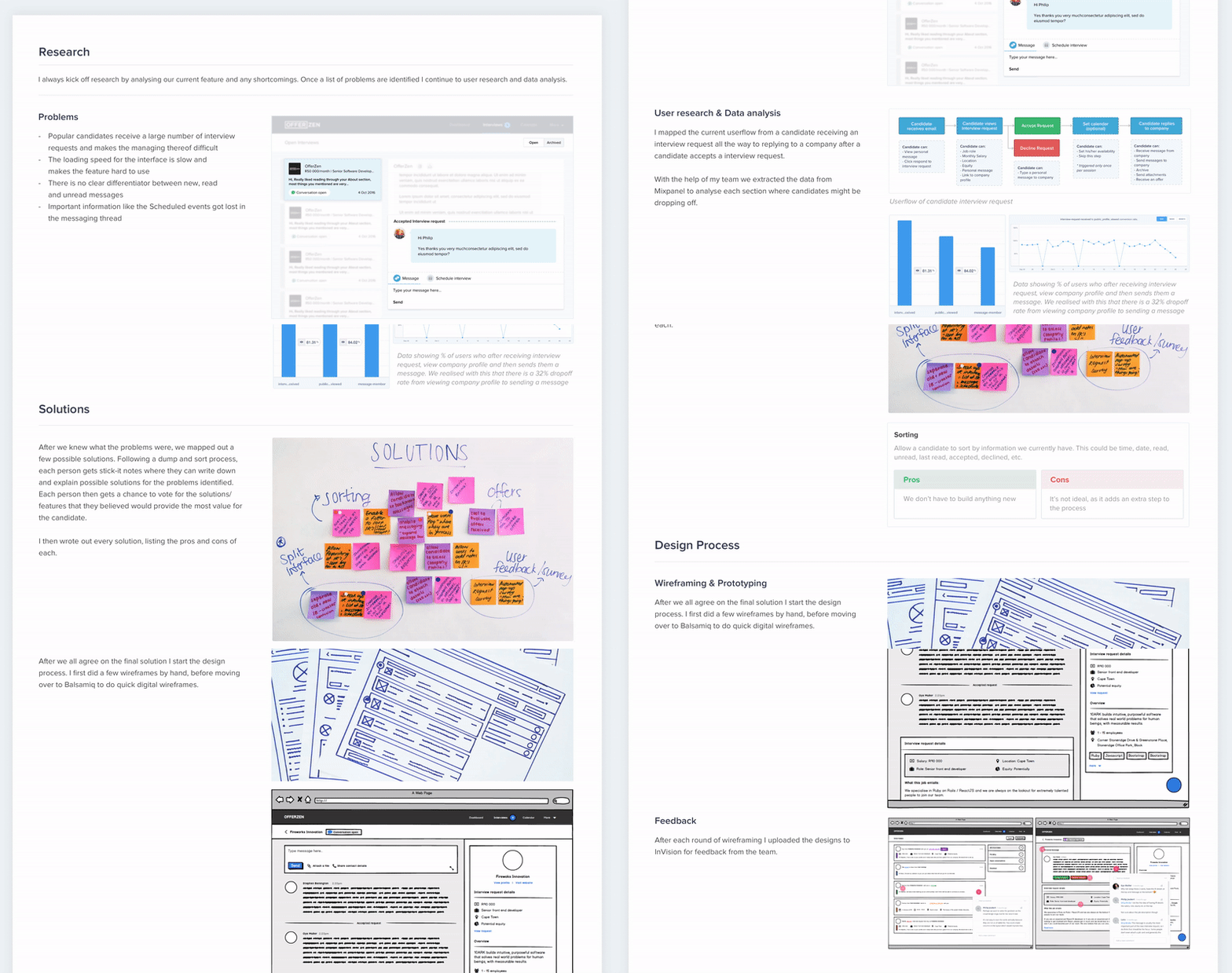
In this example, I began by showcasing the research, then explained the way we mapped potential solutions and finally showed an example of the wireframes and prototypes. We used various methods and tools throughout the process, including Mixpanel for data analytics, sticky-notes to dump and organise solutions, and Balsamiq for wireframing.
What was the final outcome?
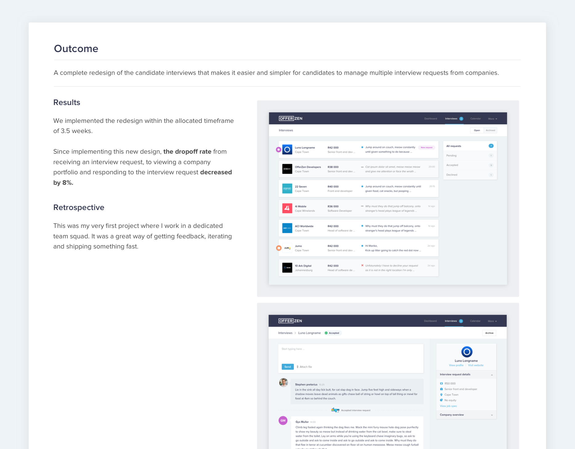
Finally, of course, comes the end-result . Here you can show the final design and discuss the outcome and next steps. Often UI/UX projects are created around improving a certain metric or performance - this is something you can and should highlight.
Including a retrospective analysis of the outcome also shows that you are reflective of your own work and realise that there is always room for learning and improvement. What worked? Why? What didn’t work? Why?
At OfferZen, we have retrospectives every Friday to discuss all our projects and even our weekly tasks. We review the objective we had for the project, the final outcome and the results.
What if I’m a beginner and don’t have much to show?
If you’re new to UI/UX design, you might not have a large scope of projects to choose from. That only means that you need to find a unique way of showcasing your skills and personality, even if you only unpack one project fully.
Remember: It’s all about identifying the problem and showing the processes you used to solve it!
Danny says, it’s important to have examples of the kind of work you want to do to land that next level role. “However, the catch 22, of course, is that you can’t generally produce it until you’re in that role. Here, passion projects are where you can go to to share.” Don’t be shy to include personal projects. They are a great way to showcase your problem solving skills since you often worked on them by yourself.
If you want to add more professional projects to your portfolio, you can also look for freelance projects. A great place to look for UI/UX projects are NGOs. Not only will you improve your skills but you can also make a real difference while doing it. Danny also suggests to make it clear that you have a desire to evolve when applying for a new job. That way, the company can offer you opportunities to tackle new challenges.
Tips for experienced designers
If you’re a senior designer who has done a great deal of work, it’s tempting to just toss in everything you’ve done. That, however, is a bad strategy. As Ruth mentioned, a company will realistically only look at about three projects - so rather add a link to your most used online presence. In your portfolio, include only your top three projects that showcase your broad range of skills. Consider what type of sector you want to work in and which projects speak to that sector. This will help you narrow down the options.
Also: Senior designers often want their work to speak for itself, so they just jot down a bit of general information about their projects. However, digging deeper in certain parts of the process will help your work stand out from the pack and really demonstrate your experience. Discuss how you built on user research or feedback for the final result. List the specific tools involved, like Google forms for UX feedback.
How long should you spend on your portfolio?
Ruth thinks of a portfolio as a continuous work in progress, a living and breathing thing, if you wish: “I think you need to have a day minimum, at least eight hours of work to put something together. As designers, if we didn't have deadlines, would we ever stop designing things? When it comes to your own portfolio, you don't have a deadline. It's just never done.” For practical reasons, it’s useful to give yourself a cut-off time for each iteration.
Set yourself a hard deadline and stick to it. It’s quite common to take between two and five days to have a well polished portfolio.
Where’s the best place to showcase your portfolio?
How or where you showcase your portfolio is based on personal preference: “Whether someone hosts it on their own website or builds it from scratch, I'm open to creative interpretation if someone has a way to present their work that's different,” Ruth says. “I've also seen it in blogs. Google has some really good blog posts about process and how they approach a particular design problem from the research to the prototyping to the final result.”
For junior designers and those just starting out, there are plenty of simple and free tools to build personal websites, like Wordpress or Wix. They don’t require any coding experience. There are also paid services, such as Squarespace, that provide more degrees of freedom if you have some basic coding skills.
In addition to blogs and websites, other options do ‘deliver’ your portfolio are static formats, such as pdfs, actual books and online platforms. Pdfs give you the flexibility to quickly tailor your application to specific companies whilst online platforms like Dribbble or Behance are great places to promote yourself and be active in the community. Either way, it’s always a good idea to keep all your choices updated - you never know what a company’s requirements are.
A great example of a super impressive online portfolio is Suzan Choy’s website. She gives a high-level overview of each project in a concise manner while placing emphasis on her processes and user research. For more examples of online portfolios, check out Adobe’s list of inspiring UX portfolios.
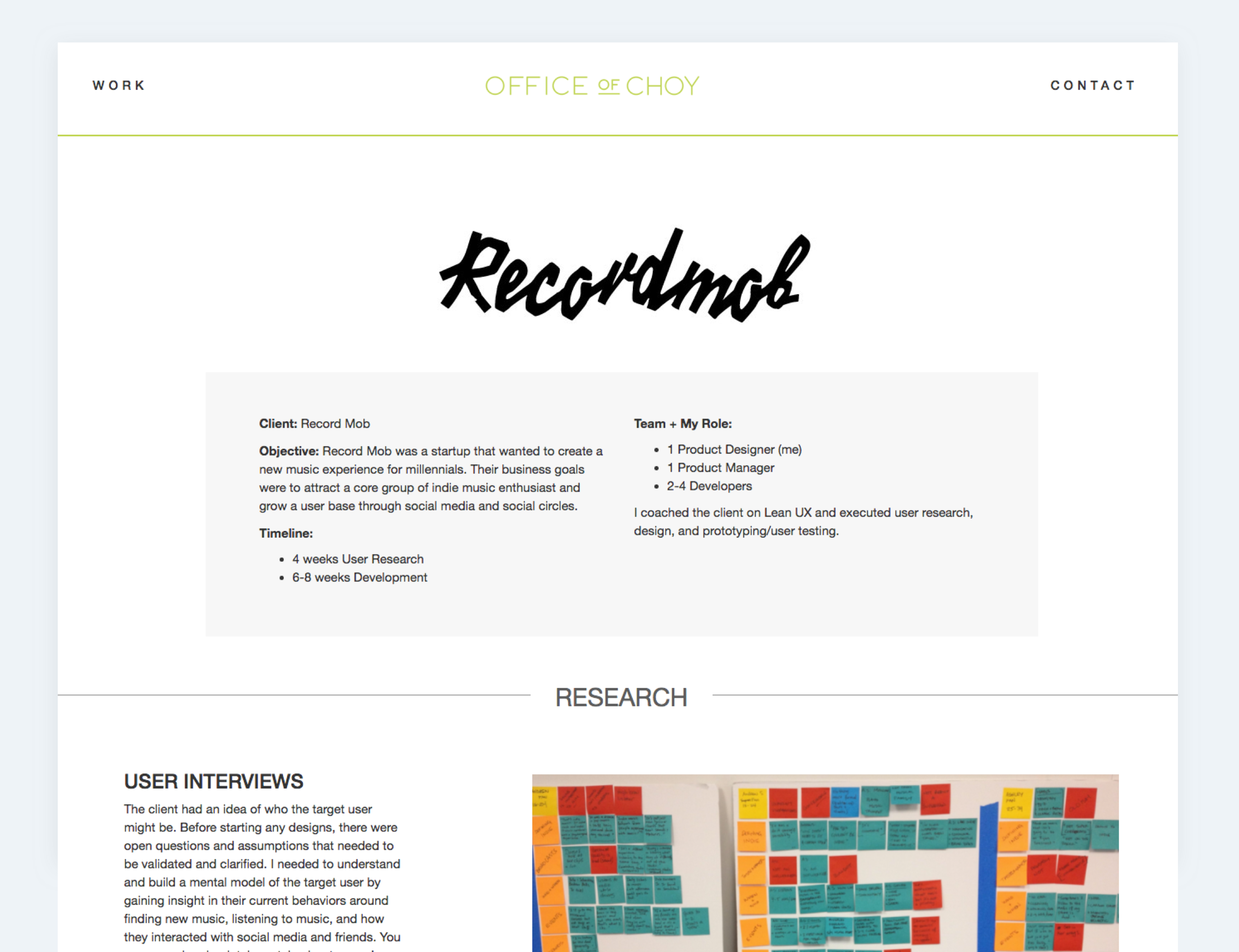
Tip: No matter what you use, treat your portfolio like any other design project. Make sure it’s clean, aesthetically vibrant and presents a cohesive message that promotes your work in the best way.
Steps to creating your portfolio
To summarise the steps to creating a great portfolio:
- Know who you are creating this for - remember the portfolio may be about you, but it’s not for you.
- Select your top 3 projects (with step 1 in mind) that best showcase your personality and skills. Cover the problem, the objective, processes and the outcome for each.
- Find a format that works best for you, whether it’s your own site, a PDF or an online platform like Dribbble.
- Add a section about you - highlight your strengths, abilities and soft skills.
- Include your contact details and links to platforms you are most active on.
What should I remember if I forget everything else?
Here is the single most important message to take away from this guide, courtesy of Danny at InVision:
“Your portfolio should ALWAYS tell the viewer a concise story of the work presented and be tailored to the job you’re applying for.”
Resources:
Creating a UX portfolio is hard enough. Luckily, there are a handful of tools that make the process much easier. You’re probably already using many of these tools for your design work, so you can simply export images or diagrams into your portfolio.
Prototyping
- InVision - for prototyping and getting feedback [free]
- Axure - for prototyping and advanced wireframing [free trial]
- Fluid - for web and mobile prototyping
- More prototyping tools
Wireframing
- Balsamiq - for creating basic wireframes quickly [free trial]
- Pen and paper - there’s nothing wrong with sketching out your wireframes!
- More wireframing tools
User research
- Survey Monkey - to survey users and record their feedback [free]
- Pen, paper and some sticky notes
Design
- InVision Studio - allows you to design, prototype and animate all in one place
- Sketch - one of the most widely used platforms for digital design (If you know Adobe Illustrator, Sketch will be easy to master within a few days. Also, there are really cool online video tutorials from LevelUpTuts.
User journeys
- Google Drawings - easy to use for user journey planning [free]
- Gliffy - to build flowcharts for user journey [inexpensive]
- Whiteboard drawings - even the most experienced designers add photos of their user journey planning from a whiteboard
