There I was, a rosy-cheeked spring chicken of a UX designer, ready to make my mark on my company. I had worked frantically to ace my first project. I delved into scholarly articles in the furthest recesses of the web, interviewed candidates, designed hundreds of low-fidelity options. All of this was in search of the golden solution: a beautiful, elegant, simple design that would capture the hearts of our users! Presentation day came. I walked into the boardroom, whiteboard markers blazing, barely able to contain my enthusiasm. Lights, camera, and… the room resounded with a unified "No! Just do it the way Facebook does it!"
I'm sure every UX designer has been overruled by well-intending but condescending colleagues at least once in their career. The point is:
Presenting UX is hard because there is never enough time to explain the deep thinking that goes into the small details.
On top of that you have an audience who have all used apps and websites. You know that they will compare apples to Apple — pun intended. So how can a UX designer have their voice heard and respected amongst stakeholders who might not understand why we design the way we do? Here's what I learned about UX presentations from five years in the industry.

The key: you're telling a story
Storytelling is UX work
Humans — we're a dramatic bunch. We're captivated by tall tales with brooding subplots; our tear ducts become fire hydrants at the will of the writer. It's ridiculous really. Luckily we UX designers can use this to help us build better presentations that captivate our audience. And no, I'm not telling you to make your CEO cry.
I know what you're thinking: Why must I 'resort' to storytelling to present my work? Surely a developer wouldn't have to tell a story to sell their system architecture to the CEO, so why should a UX designer?
The thing is: Storytelling is in itself UX work. A designer's job is about more than just designing a product. It's about being — as Slack designer Diogenes Brito so eloquently put it — a facilitator, a steward and a connoisseur of design. It's your job to help your team visualise a dream, to unite your stakeholders and ignite their passion for the product. Telling a story helps you do this.
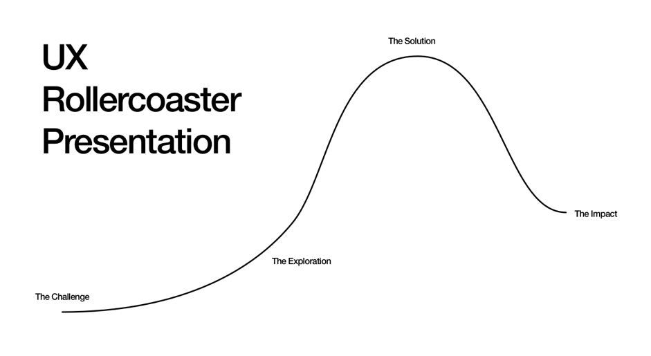
To tell a good story, structure your presentation like a roller coaster
So how do we tell a good story with our UX presentation? Let's break it down. Every good story begins with some sort of challenge ("Oh no, Romeo and Juliet can't be with each other! Their families are out for revenge on each other") and then proceeds to an exploration to overcome the challenge ("What will Romeo and Juliet do? How can they break the cycle of revenge?"). The tension builds up until a solution is found ("Romeo and Juliet will run away"), and finally, its impact becomes clear ("Romeo and Juliet end up dead, but on the bright side, the families bury the hatchet!").
We'll need to write a story that grips our audience. After all the ups and downs, it should leave them smiling and letting out a sigh of relief — a roller coaster, in other words:
Part 1: The Challenge
To make this more concrete, I'll use my very first project at Leadhome as an example. Leadhome helps people sell their houses. The first step in that process is that people need to book a free valuation. This was the challenge to our UX team:
"We need to improve the conversion rate of people successfully completing our online booking process for home valuations."
Sounds simple, right? Not quite. There are so many constituent problems packed into that task. We could, for example, ask:
- What is causing drop-off?
- Where exactly are people dropping off?
- Can conversion even be improved or is it just a natural drop-off?
Your challenge will likely contain many smaller problems, too. By unpacking and breaking these problems down for your audience, you help them understand the challenge you're trying to overcome. That way, you're setting the stage for your solution. This also gives your audience the tools to usefully critique your work. It allows them to ask, for example: "Did the ultimate design address the core areas of the challenge?"
TIP: Imagine your challenge is a fruit basket and you need to explain it to your audience. To do this, you need to take out each of the fruit (problems) individually, show it to your audience, and explain what it is: "Okay group! This is the mango, one of five fruit in this basket. To understand its flavour we conducted a series of interviews with other fruit lovers and here's what they said…" It might seem elementary, but it establishes the bounds of your design challenge, and usually gets an "oh wow" from your audience.
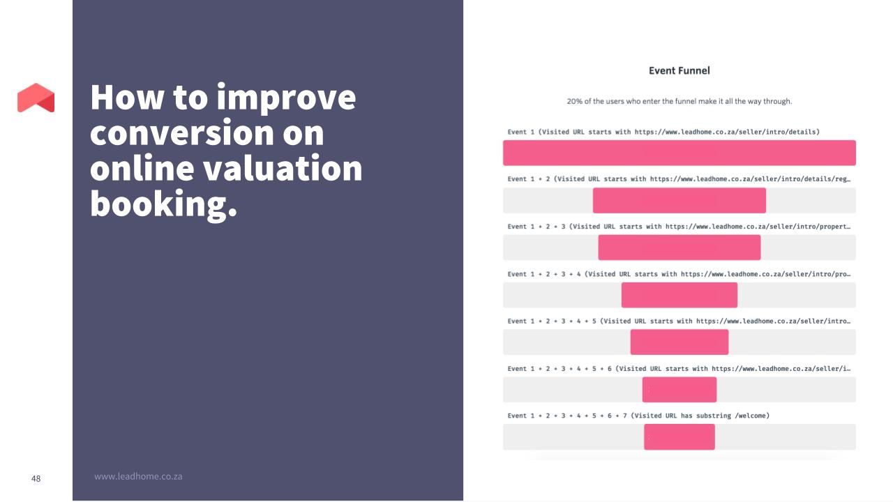
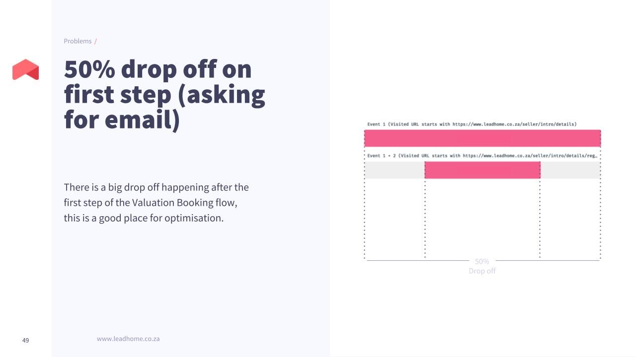
Below, you'll see how my Leadhome UX team and I unpacked our challenge. In this case, our fruit basket was the overall conversion rate. To understand the overall conversion rate, we had to look into our analytics at each stage in the underlying flow of visitors. We highlighted prominent drop-offs (e.g. from the first to the second stage) and looked at the problems in each of these areas. By explaining each of these "pieces of fruit" to the audience against the backdrop of the bigger picture, we were able to help them understand the challenge.
Part 2: The Exploration
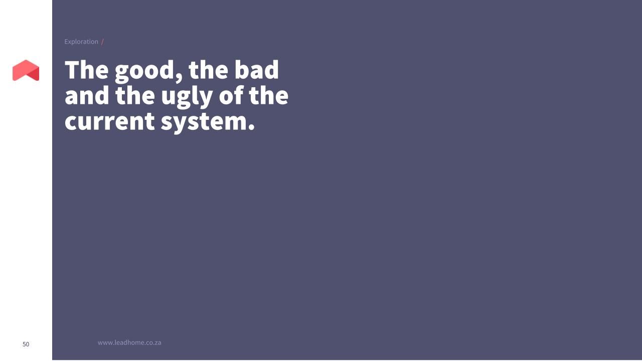
The next part of our UX presentation rollercoaster is to show how we explored options for overcoming the challenge and, believe it or not, how we failed. Showing how you failed is important because it helps your audience understand why your ultimate solution is superior. The idea is that you guide your audience to the same conclusion as you. Unpacking your failure shows that you didn't just go with the first thing that popped into your head. Instead, the audience can see that you approached the problem from different angles, experimented with different solutions, and picked the best of the batch.
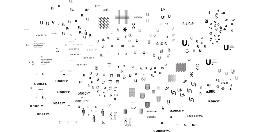
Here's a great example of an exploration slide that one of the world's leading design firms, Focuslab, did for their client, Udacity. The slide says: "Hey client! We didn't just pull a rabbit from a hat; we worked hard to find the perfect fit for your brand." Even though some of these logos are awful, they give the audience perspective on everything that the design team tried before eventually settling on a final option.
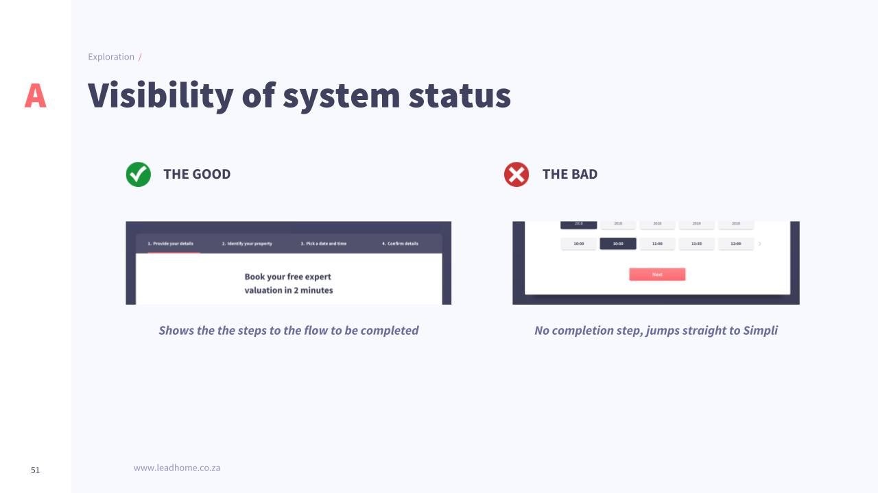
For our project at Leadhome, we explored what's good and bad about the previous booking process. We used a few short, concise slides to give the audience insight into this. On each slide, we highlighted a specific aspect (e.g. "Visibility of system status") and then illustrated what's good and bad with screenshots and short descriptions. In this way, we set the audience up to understand how our new solution would address the previous system's shortcomings, but also build on its successes.
Part 3: The Solution
It's time for that big fat crescendo, that stomach-lurching drop in our rollercoaster presentation: the solution. We all know the feeling: hands shaking, knowing that the next slide will either be praised or be met with scowls. If it does in fact go poorly, we can't help but think: "Was the solution bad, or was it the delivery?"
Now, needless to say, your solution needs to be solid in and of itself. What makes a solid UX solution is a topic for a different article, but there are two important things you can do to improve your delivery.
Firstly, show confidence and passion. There is few things more concerning to managers and other seniors than a solution delivered half-heartedly and without passion. They'll be focusing on quality assurance: They want to be able to sign off on a design knowing that it is sound and won't cause any problems down the line. If you're not confident and passionate, it creates the impression that you're worried about the solution yourself. Some might even think you're just trying to get through the presentation before anyone realises the holes in your plan.
Confidence comes from the surety that you are justified in your solution. Make sure that whatever you are presenting is, at least to the best of your knowledge, tried and tested. This will shine through in your delivery.
Secondly, bring the chocolate! What really makes a solution hit home is when it goes above and beyond the expected result. As the folks at design agency Ueno like to say: bring the chocolate! Add some sugar to that design! Use tricks like a Before/After slide to emphasise changes and add fancy little animations to illustrate processes. Make it slick!
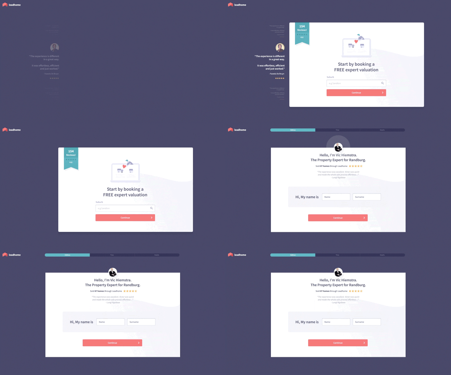
Here are the slides from my team at Leadhome. We were showing a high-fidelity mockup of our solution. The interactions and animations were a key part of our solution, so we included GIFs in our presentation to highlight them. (And yes — you can actually add GIFs to Google Slides! Amazing right?)

Part 4: The Impact
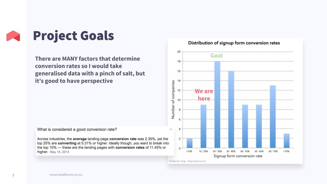
It's important to remember that your audience is not a group of kitsch art critics with tall wine glasses. They're a team working to build a great company, so as much as the visuals matter, you also need to show them how the project will contribute to the bottom line and the bigger picture. It works well to illustrate the impact in terms of specific, quantified metrics, such as profit or even customer happiness. Showing the numbers makes it more concrete.
While you're at it, you could also say something about the team impact of the project. Create some slides of your team members and their highlights during the project. Point out how they contributed to the overall quality of the design. Show what you all learned.
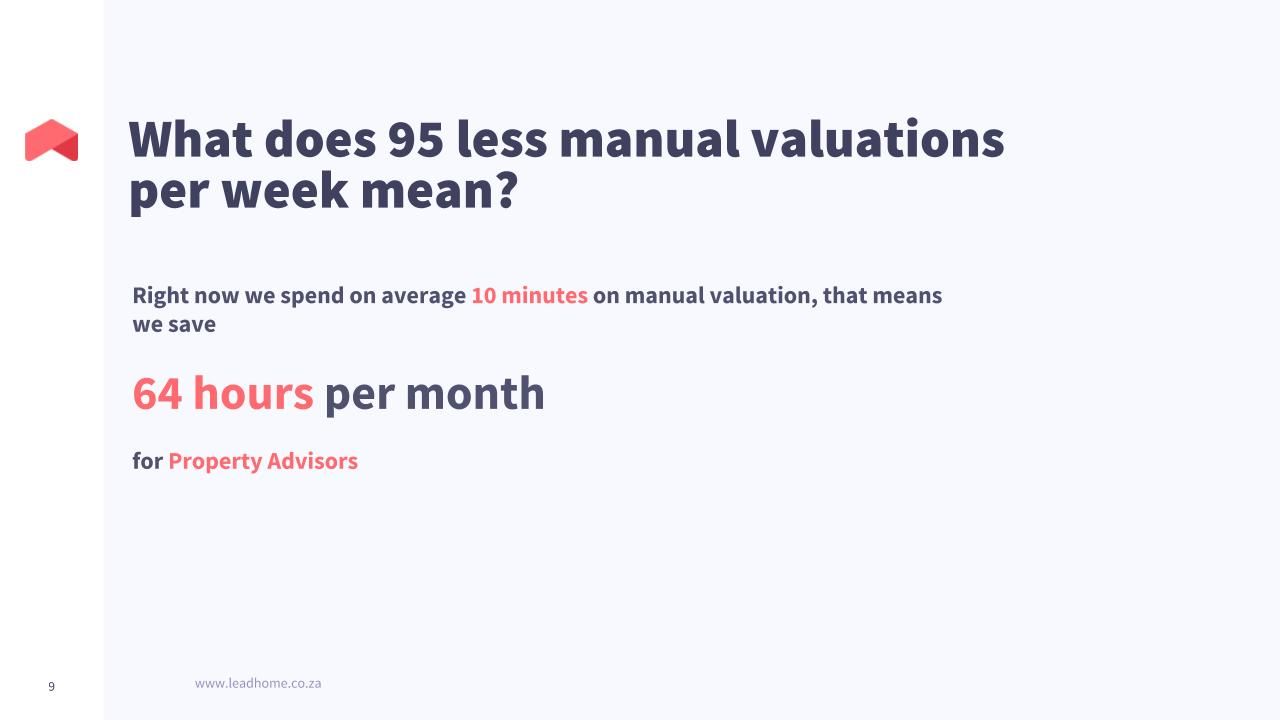
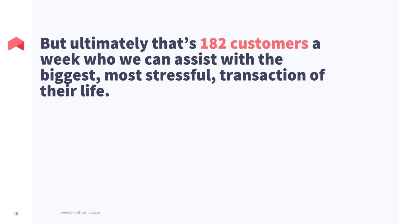
Below you'll see how our UX team at Leadhome showed the projected impact of our project. We wanted to give our audience a point of reference — a baseline. Once we did that, they could better understand the improvement we were hoping to achieve through our project. Thereafter, we expanded on what it would mean for the business if we achieved our intended conversion rates. In our case, that was: time saved and more customers served.
When the roller coaster comes to a stop...
What does all of this mean for you as a designer? If you are able to present your UX work solidly, you will build trust with your stakeholders. They are not only more likely to respect your work, they might even enjoy your solutions! You're already meticulous about creating amazing experiences for the users of your product, so it makes sense to apply that same mindset to your UX presentations.
Cheatsheet: My key heuristics
There is so much more I can say on this topic, but instead of boring you with a convoluted 100-page essay, here is a small cheatsheet that I set up for myself.
- At all costs, keep it simple. As a rule of thumb, rather have multiple simple slides than one overwhelming slide. Use lots of whitespace and never add more than three bullet points per slide. Keeping your slides simple ensures that your audience doesn't miss anything.
- No UX lingo allowed. Stay away from UX specific terminology like "mental models", "affordance", and so on. It distances you from your audience: it makes them feel disconnected from you and excluded from the conversation. Making things easy to understand is your job, so there's little harm in dumbing down your points a little.
- Present decisions, not options. Commit to only those solutions that you really believe in and present those, instead of showing your audience all the options and making them choose. If you absolutely have to make them choose, at least narrow the selection down to a few radically different options.
- Don't use boring visuals. UX and design is a great blend of art and science, so entertain your audience by showing them beautiful visuals or engaging data. People love pictures, let me tell you!
- Bring back real people. Remember that you are designing for people. Show that you talked to those people by adding quotes or at least showing some faces in your presentation. This really helps your audience keep your end user in mind.
- Emphasise collaboration. Most of the time, you are going to be collaborating with people, either fellow UX designers or interview candidates. Mention them in your presentation. This shows that you aren't a genius with a thousand helpers but a team player who gives credit where credit is due.
Zandre Coetzer is a Senior UX Designer at Leadhome and a User Research evangelist. Most of all, though, he loves enhancing experiences, one pixel at a time. Find him on Twitter and Dribbble.
