Optimising a web application's performance leads to greater efficiency and ultimately a better user experience. But often, this is left until later in the development process. Here I share some of my easy-to-use tips and tools for developers of all skill levels to improve their web application performance while it's in development.

Web development has continued to evolve over the years. But in my 10+ years of building different web applications, the goal is still to create an amazing experience for users as they carry out any tasks or find information they might be looking for. This means that a website's effectiveness goes beyond its built functionality to include how easy it is for people to use it successfully. This is where accessibility and performance come into the fray.
A look into what the web is like today
The web has always been very easy to build for - from a single HTML page that can be deployed as your website to bigger applications with more complex infrastructure.
This simplicity makes the web also very accessible from almost any device and anywhere. You can access the web on smartwatches, PlayStations, TVs and different types of computers and mobile devices.
There are so many tools available today that make it so easy to start building complex solutions for the web. However, they come with their own downside too. The web is now super heavy with JavaScript running to make special, and often very good-looking, experiences work. It's also filled with a lot of media for consumption.
Unfortunately, what this means is that users have larger files or content to download, making their experiences either much slower or increasing their data consumption.
This is a huge problem because the cost of data is quite high in a lot of countries, resulting in users clicking away from a website that takes longer to load because it could mean they have to spend a lot of data to view the page.
The cost, speed and ease of this experience is why we have to consider web performance from the get-go.
What is web performance?
According to the MDN Web Docs, "web performance refers to how quickly site content loads and renders in a web browser and how well it responds to user interaction".
A lot of things can affect how quickly a site loads - ranging from high-definition images used on the site, large JavaScript files, video content or even poor internet speeds.
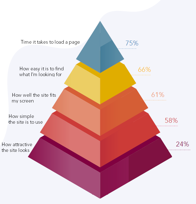
Regardless of the challenge, it's still very important to prioritise the speed of a website, as a lot of users rate the time it takes to load a page at the very height of their user experience hierarchy.

Source: Speed Matters.
Web performance, in a nutshell, is all about making websites fast, including making slow processes seem fast.
However, performance optimisations are often seen as a very daunting task, leading developers to leave it to later in the development process and end up either never getting to it or making it increasingly more difficult to do. This leads to shipping products that have a lot of room for improvement.
Implementing web performance practices at the same time as I build has helped me save time, effort and cost in the long run. All the while ensuring that my website performs much better. But before I get to these practices, let's first take a look at some performance metrics I look out for.
The web performance metrics to measure and improve
You can only improve what you measure, and because of this, Core Web Vitals were introduced as an initiative by Google to provide a standard and guidance for things to look for to ensure a great user experience on the web.
These metrics are spread across loading speed, interactivity and visual stability.
Aside from Google's three Core Web Vitals, there are also a ton of other metrics that measure similar things. But since we want to make this as easy as possible to get into, these are the five I try to look out for in my own workflow:
How long does it take before the user sees anything?
A user's perception of how fast a website loads is greatly influenced by the first sign of the website they see, so we want to make this as quick as possible. This time is known as the First Contentful Paint (FCP). It is recommended to be around 1.5 secs for the best experience.
How long until the user sees the largest thing that loads in the viewport?
Until the largest file or component loads up on your website, it's going to keep loading. If it loads for too long, it will have a negative impact on the user's perception of the speed of the website as well. This time is measured using the Largest Contentful Paint (LCP) metric, recommended to be around 2.5 secs.
How long does it take a browser to respond when a user interacts with a site?
We also want to make sure that as the components on a website load, they are interactive immediately. This time is measured using the First Input Delay (FID) metric. This is recommended to be less than 100ms.
What is the visual stability of a page load?
Visual stability of your web page is very important. You don't want users trying to click a button and then it moves away or disappears. This is measured using the Cumulative Layout Shift (CLS) metric. It is recommended for websites to have a CLS score of 0.1 or less.
I look out for these five metrics specifically because the steps to improve them fit into my development process, and they impact the everyday user's experience directly. Largest Contentful Paint, First Input Delay and Cumulative Layout Shift are the three metrics in the Core Web Vitals by Google.
All of these metrics can be measured with handy tools on the internet, some of which are mentioned later in this article.
Easy to implement performance improvements I use
To make the initial jump into performance improvements, here are a few activities and principles to keep in mind and integrate into your existing workflow. I do these for my projects, and they help me develop with performance in mind already, instead of allocating additional time or resources at the end of a project.
Compress images and scripts as you implement them
This is a common way to improve performance. We are able to reduce the file sizes of both images and scripts that are essential to our website, leading to less time to download and also parse by the browser. This can be done using image compression software like ImageOptim and minifying JavaScript and CSS files.
Build mobile-first experiences
It is said that 55% of website traffic comes from mobile devices. Building with the mobile experience as the first priority allows you to design and optimise your website for smaller devices before optimising for larger screens. This means the base experience of your website is designed to be fast and would work much better on slower devices or internet networks.
Remove unused JS code when you can
JavaScript files can grow to be quite large to accommodate all the functionalities we want. So as much as possible, we want to remove JS code that we aren't using. This reduces the file size and, in turn, speeds up your website. I find myself checking for this after a major feature update or rewrite. Using tools like LightHouse in your browser's developer console can point you to some JS files that are unused.
Self-host web fonts
By hosting font files on your own server, rather than relying on a third-party font provider, you reduce the number of external requests your website needs to make, which can help speed up your website's load time.
Handy tools for reviewing and improving your web performance
Aside from building these web performance activities into your workflow, there are also multiple tools out there that not only review your website under different technical limitations, but also provide actionable recommendations on what you can do to make improvements right away. They go a long way in identifying gaps you might have missed and also which files could be affecting performance in general.
These two are my favourites to use:
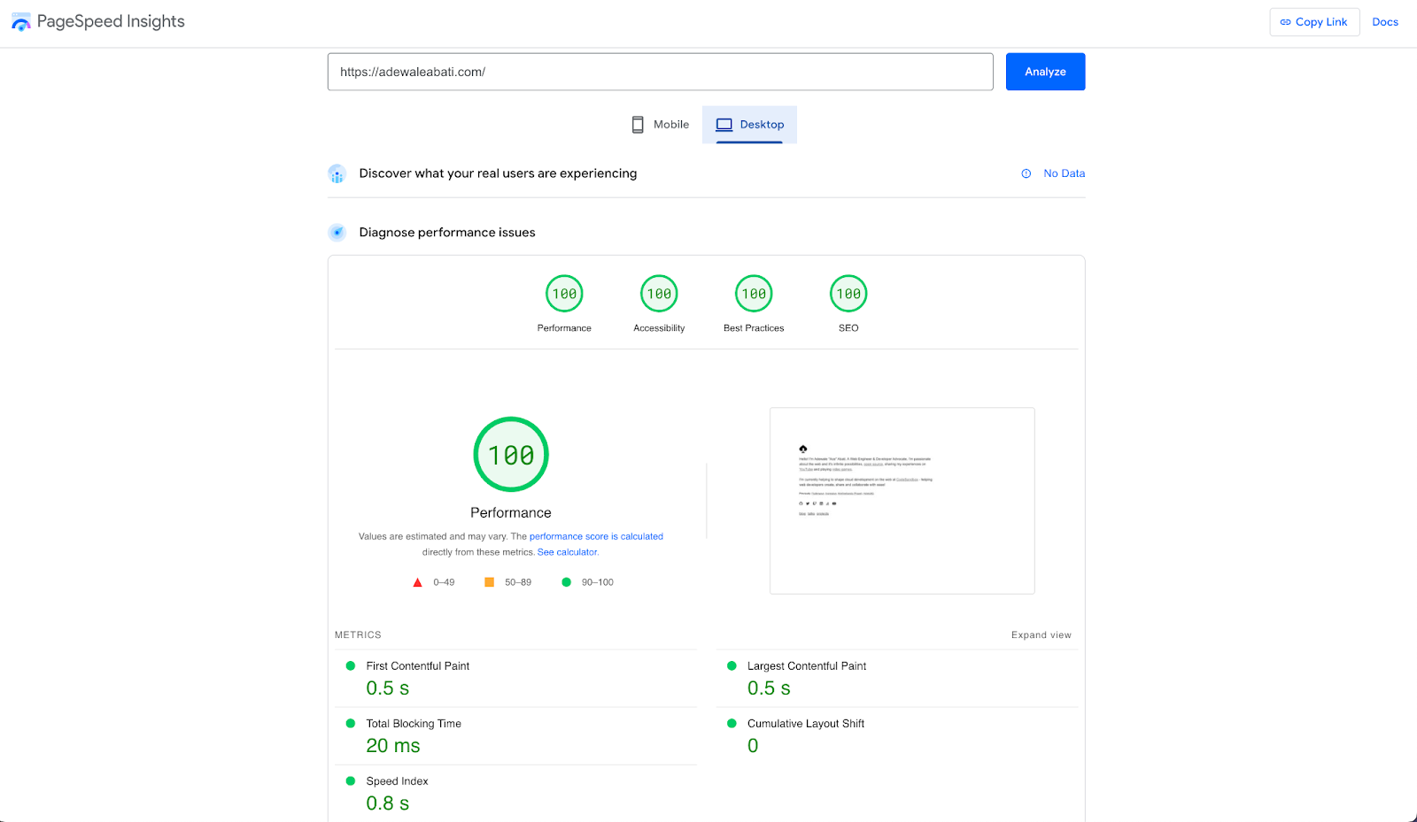
PageSpeed Insights
PageSpeed Insights (PSI) by the Google team helps report on the user experience of a page on both mobile and desktop devices and provides suggestions on how that page may be improved.

It may not work best to review pages that are behind an authentication wall, but it's a great way to review pages directly accessible on the web.
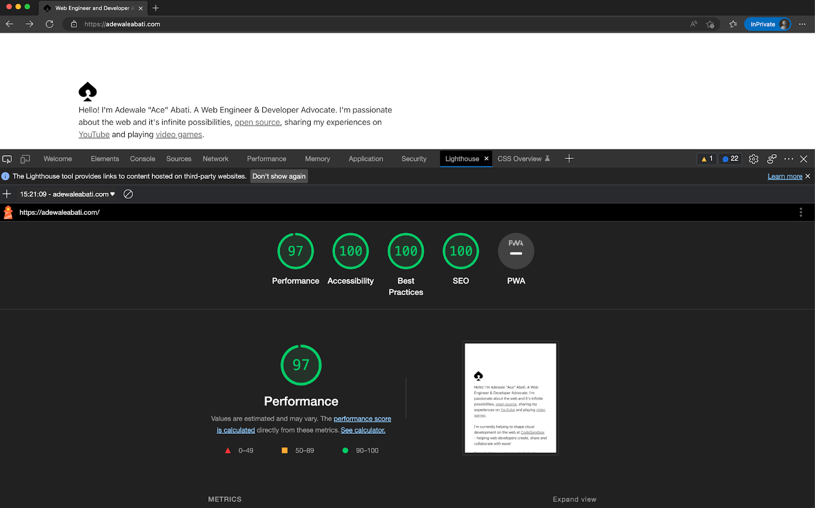
Lighthouse
Lighthouse is an open-source, automated tool for improving the performance, quality, and correctness of your web apps. It sits right in your Chrome browser - in the developer console - and can be used to run a variety of tests on the current webpage. These tests include simulating different devices, varying internet speeds and overall performance.
It also addresses and provides recommendations across accessibility, best practices and SEO improvements for your websites.

I use both Lighthouse and PageSpeed Insights to test landing pages, direct links, and individual pages. I mainly use them when I'm finishing up the development of a page or when I add something new to the website and want to see how this new feature or integration affects it.
Conclusion
Thinking of performance as a critical part of your development process drastically saves you time that would have been allocated to a later stage. You then end up with a product that shows you've kept the user in mind throughout the process while expending as little cost and effort as possible. And ultimately, prioritising web performance improves the overall experience of your users.
There are many more tools and practices that you can integrate into your workflow, some of which take more time than the next, but with this, I hope you've been able to see how you can already start making improvements to every website you work on.
Adewale “Ace” Abati is a web engineer and Developer Advocate. Ace is passionate about the web, open source, and the developer community. An avid gamer who also shares his developer experiences through his social media, technical writing, public speaking and YouTube.
